DESCRIPTION:
For this project I was given the challenge of creating a National Park poster. I chose Zion National Park because I have experienced it before and it is by far my favorite national park.
PROCESS:
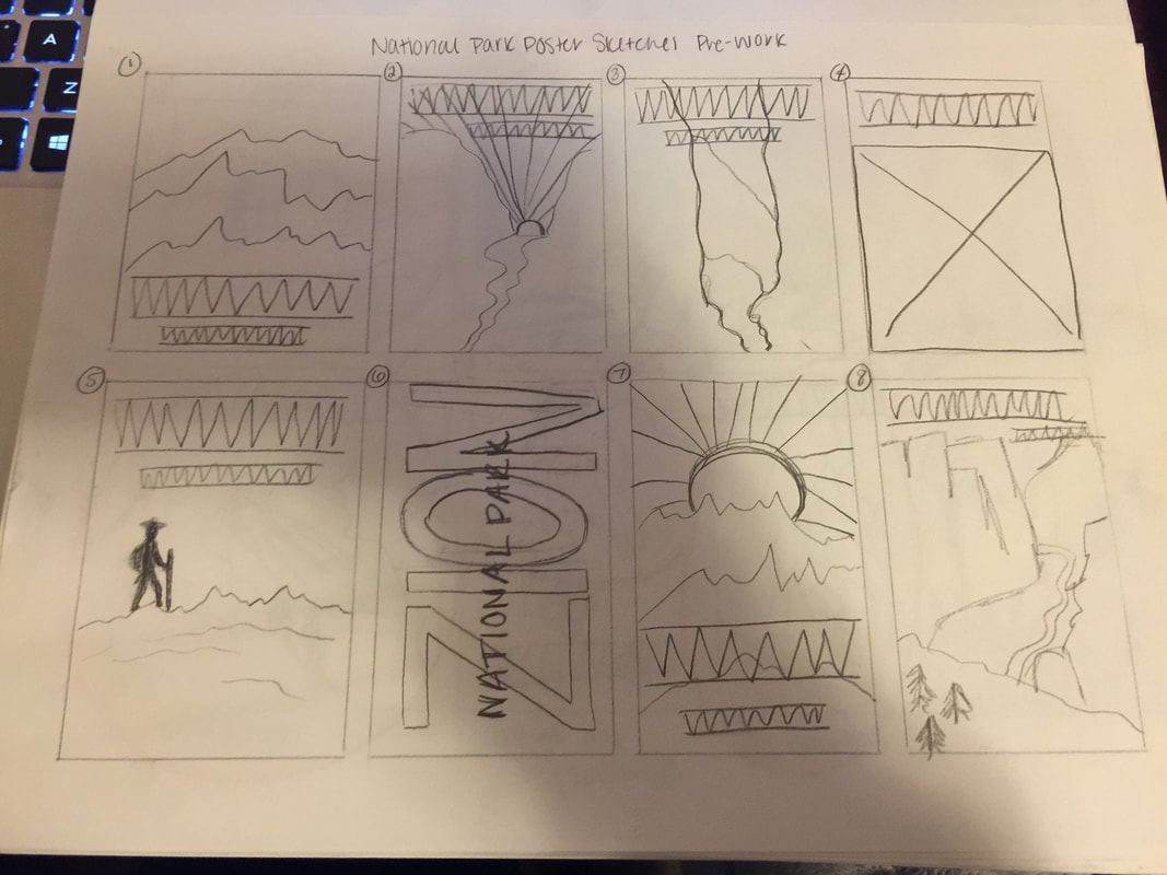
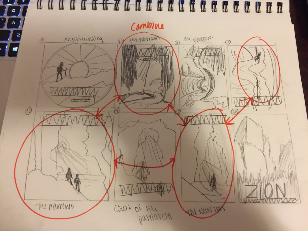
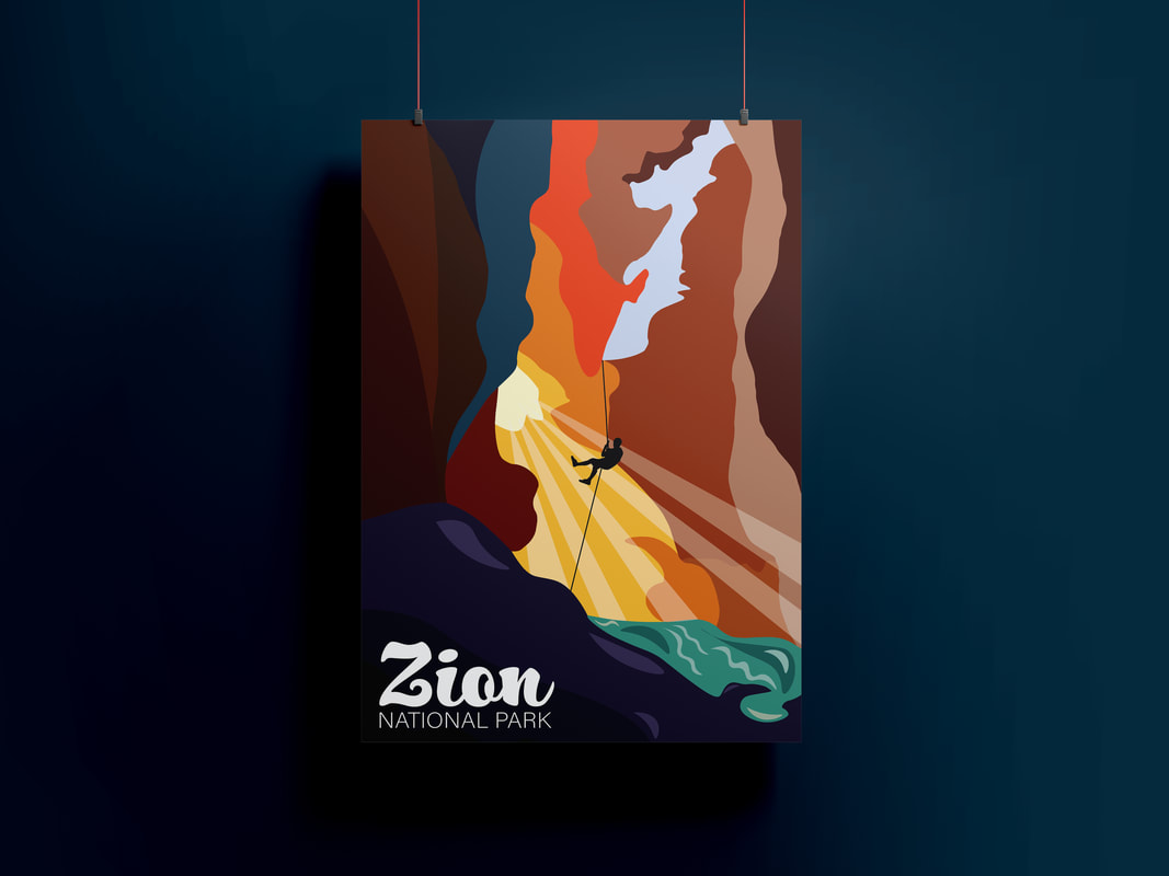
My process started by pinpointing three key words or phrases that define the park best: Epic, Out of this world, and Adventure. One of the most known hikes in the world happens to be at Zion National Park and it is called the Narrows; this was my favorite hike that I did there and to me it defined all three of the keywords/phrases. I started by sketching out different compositions and perspectives. I decided on this composition because I thought that the perspective was the most unique and gave the poster a sense of wonder. My goal with this poster was to make the sharp and rigged rocks look curvy and organic to give it a fantastical aesthetic while still being identifiable. I chose these colors because they are slightly exaggerated of what it really looks like but they make the poster pop and help add the "out of this world" look that I was going for. I chose the font that I did because it carries on the organic shapes that I was wanting to incorporate. This poster stretched my adobe illustrator skills with the pen tool and taught me a lot about color and perspective in compositions.
For this project I was given the challenge of creating a National Park poster. I chose Zion National Park because I have experienced it before and it is by far my favorite national park.
PROCESS:
My process started by pinpointing three key words or phrases that define the park best: Epic, Out of this world, and Adventure. One of the most known hikes in the world happens to be at Zion National Park and it is called the Narrows; this was my favorite hike that I did there and to me it defined all three of the keywords/phrases. I started by sketching out different compositions and perspectives. I decided on this composition because I thought that the perspective was the most unique and gave the poster a sense of wonder. My goal with this poster was to make the sharp and rigged rocks look curvy and organic to give it a fantastical aesthetic while still being identifiable. I chose these colors because they are slightly exaggerated of what it really looks like but they make the poster pop and help add the "out of this world" look that I was going for. I chose the font that I did because it carries on the organic shapes that I was wanting to incorporate. This poster stretched my adobe illustrator skills with the pen tool and taught me a lot about color and perspective in compositions.